For the Drawing II portrait assignment, half of your self-portrait will be done realistically and half will be simplified or abstracted.


So how does one begin to approach realistic application of color for skin tones?
The keys are good observation from reality and to also be wary of symbolizing skin tones as yellow, orange, pink, or brown.
Know that you will need to blend with a combination of different primacolors and that no one pencil will do the job.
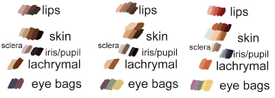
From dark to light complexions.
The lighter the skin tone, the more that shows through from underneath.
(images and skin palettes above from Mayrhosby Yeoshen)
Remember just like any inanimate subject, the forms of the face follow the rules of light and shadow. Stay aware of your light source and render the forms with highlights, midtones, and shadows in mind. This means keeping your values in mind as well as color!
Additional tips:
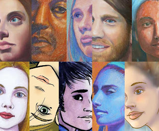
Be careful of using flat brown alone to create shadows, it can quickly begin to read as dirt on the face.
Also avoid flat black for areas such as the nostrils and mouth. Lean toward dark warm valued colors to maintain a feeling of flesh and life.
(see image below)

Here is an extremely useful link about skin color:
There is a wide span between realism and abstraction- explore the options and have fun designing your portraits!


